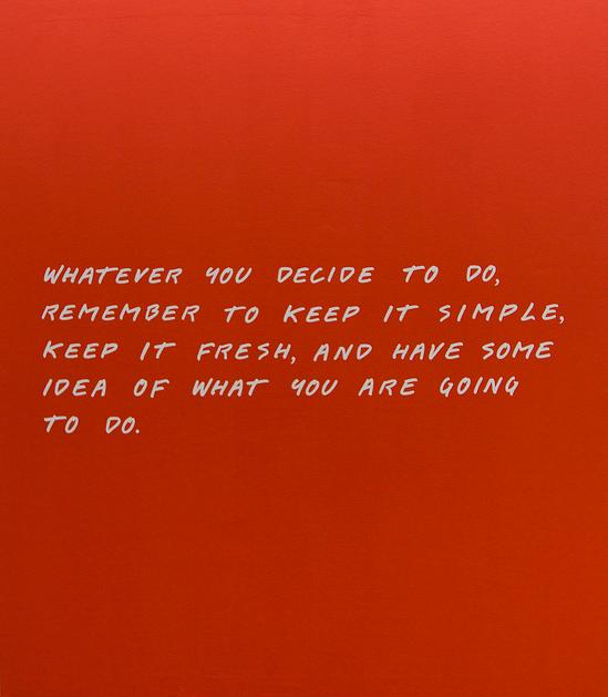
“Whatever you decide to do, remember to keep it simple, keep it fresh, and have some idea of what you are going to do.”
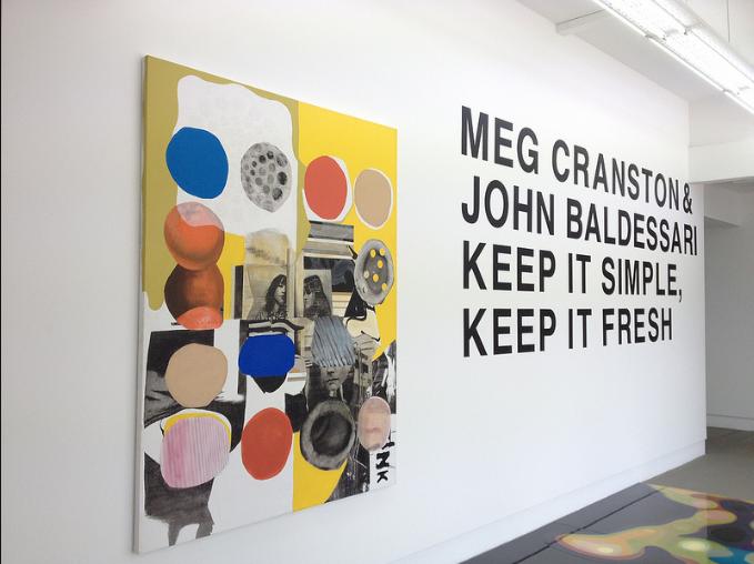
It is rare to stumble upon newly available artwork created by such prolific artists as the two I spotted at Galerie Michael Janssen (Singapore) in this collaborative show by John Baldessari and Meg Cranston. A discussion with the artists also brings us fantastic insight into their thoughts on colour theory, the secret of emerald green, John’s prolific postcard writing, violet and yellow traffic lights, and the interchangeability of words and images.
Baldessari is one of the most influential artists of his generation, pioneering conceptual art in the 1960s with his text and image artworks, and shocking the art world when he announced that he was cremating all the paintings he had produced between 1953 and 1966.
As an ‘artist’s artist’, many creatives respect and have been influenced by him through his teaching, his art, and his life. By means of productive gaps between image and word, Baldessari focuses on the relationship between language and power.
In her practice, Meg Cranston investigates the intersections between individual and shared experience and how imagery and objects acquire meaning in our culture. Her work is ultimately concerned with the formal language of art and the role the artist plays in helping us see the world in new ways.
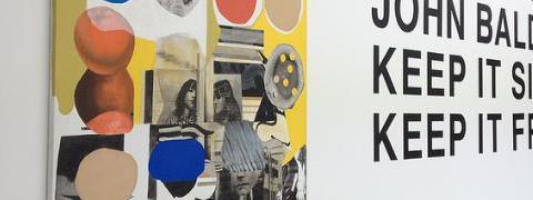
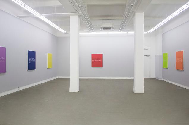
Inside Galerie Michael Janssen, hang a number of canvases featuring a text by Baldessari, handwritten on a colored canvas supplied by Cranston. The text is an excerpt from one of Baldessari’s writings entitled Advice to Young Artists. “I wrote the text in 1968 but I think it still holds true today. It has always been a touchstone for me – to keep it simple but with luck, of course, to create some profundity too. I stand by the text. It still seems like a good idea”.
The exhibition is a fantastic opportunity to experience a show created by these artists specifically for Singapore, and to view brand new work by Baldessari whose art is virtually impossible to obtain. I was lucky enough to speak to both fascinating artists to get some exciting insight into the creation of the exhibition:
Nicola Anthony: You have worked on joint projects before – did new things come out of the collaboration at Galerie Michael Janssen?
Meg Cranston: Yes we have worked together a few times before – a couple of times on works, and also curating shows. But our most recent project is a book of John’s writings, together with Curator Hans Ulrich Obrist of the Serpentine Gallery in London.
Collaboration is always a matter of someone inviting us so when Michael Janssen invited us to do a 2 person show, we thought it would be fun to do something together – as we have been working on the book, we wanted to use something from that. I have been working for a couple of years now with John looking at his writing, and he’s been re-looking at his work from the early 60s. The quotes in these paintings come from that era.
NA: So as you look back, do you see that the writing has evolved or changed – what developments have there been in the messages or the way it’s being communicated in this show?
MC: This is my favourite quote from the book – my favourite bit of advice, from a longer text called ‘advice to young artists’ written in 1968 which John wrote a lot about.
Much of John’s writing is written as handouts for his students at California Institute of the Arts, so he said “Keep it simple, keep it fresh, and have some idea what you’re going to do” – it’s generally good advice. I paired it with the colors because I wanted the paintings to be realistic – to reflect current conditions.
John Baldsessari: I believe in cutting to the chase, in using simple language and in saying what you mean. That’s been pretty consistent. I have never liked being authoritarian. I prefer to suggest things rather than prescribe. I wrote the text used in the paintings in 1968 but I think it holds up. I still try to keep it simple.
NA: And has contemporary language and the new terminologies forming around say social media, affected the use of text?
MC: Its interesting, John is a mad texter, and jumped in with both feet, but he used to be a real postcard sender. He’s wonderfully concise in his writing, and so postcards were perfect for him, and then texting was perfect for him.
NA: The concept of repetition comes into the paintings – through the paintings being reproduced in different colours, equally spaced around the room, and also in past works through the same sentence being repeated on a canvas. Is the repetition almost like a mantra? Could you tell us about the significance of these elements?
MC: As you know, John’s famous piece – ‘I will not make any more boring art’ – was a kind of punishment piece. So there is that history in his work which we decided to carry through. The colour comes from my research of the colours that are forecasted by the Pantone Corporation. Every season 10 colours are forecast as ‘the colours’ – and to an astonishing degree, they are the colours. The no.1 shade this season is emerald green. Here you see it…
[Meg flicks through some fashion magazines, pulling out the emeralds, and linking the other soft or bright shades of the canvases in front of us at Michael Janssen to pages in Vogue].
I find it amazing how controlled our built environment is, colouristically. So as an artist I was interested in this idea – if I walk into a dress shop, I ask why the people wear the colours that they wear, how did that choice develop? I discovered that there really is a system that every manufacturer buys and follows, because besides price the number one reason people purchase is colour. Knowing that intrigued me. I joked with Michael – that he might not like these colours now, but he will!
NA: It’s fascinating that you’ve been through quite a different process to the normal artist’s approach to choosing colour – where it is often selected or plucked from real life, here you have challenged color theory and placed faith in predetermined color forecasting.
MC: I see it as realism – this is real life, as a lot of artists are influenced by the media, so this really is from the media – if you look at spring Vogue, you will see all of these colours – almost to a scary degree.
NA: So it’s like being influenced by the media, just at that stage before the rest of the world knows it? It’s interesting that it’s a kind of ready-made or ready-selected colour.
[quote]Instead of Catholicism or religion, now we are programmed by the corporations[/quote]
MC: Yes it is a readymade, and I’m not saying it’s diabolical or bad, it’s just a fact of life – In another society or another time, colour was programmed for religious reasons, such as the Catholic Church which has a colour programme to follow. Instead of Catholicism or religion, now we are programmed by the corporations.
NA: You have both created work in the past that juxtaposes certain images or texts, and using found images to place together – does that link into the work here?
MC: Certainly John’s work – he’s very seldom used just an image or just a text, it always needs conversation between elements, so this is definitely consistent with his work. He often uses found images. In a way these colours are found. Most artists wouldn’t admit this but one of the real troublesome things about painting is that each colour is beautiful – so which one do you pick? It was an experiment to see how the two things come together. We wanted it to be simple and up to date.
JB: Part of the idea of repeating the same text on different colors was to see how one affects the other. We thought the different colors would create the equivalent of different tones of voice with the high contrast paintings being sort of loud and the low contrast less legible paintings being the equivalent of a whisper.
NA: John, this use of the Pantone system perhaps links into your own working method of indexing images to use as future visual materials. Do you hope the pairings of the colours and the text will affect the reading of each canvas for the viewer? …And do you think this might change across different cultures such as here in Singapore?
JB: Color signals different things in different contexts so, I’m pretty sure the works will read differently in Singapore. I don’t know enough about Singapore to say what those differences will be but, part of the reason artists do exhibitions in other parts of the world is to expose the work to new audiences who will have totally different reactions….
…Years ago an art dealer told me that whenever an artist gave him a purple or violet painting he would have to discount it 20% because, at the time, violet didn’t appeal to American collectors. A violet painting in the context of the Singapore show doesn’t seem to be a problem but someone told Meg it was a good thing we didn’t do a white painting because that would never sell in Asia.
It’s fascinating stuff. I suppose somewhere in the world one could have a violet and yellow traffic light and everyone would think that was perfectly logical.
NA: As many of our readers will know, in the 70s, John destroyed a lot of his artwork by cremating it, when he suspected that art might be more than painting. For you both, there has always been a notion that the value of the artwork lies in the fact that it has been conceived of and created – the concepts – rather than the physical artworks or the author/painter of the artworks themselves. Is that still the case?
MC: We would both still say that art itself is about ideas and belief, I had a a group of ladies here today who knew nothing about art, and so it was an open question – they either believe or they don’t. Having said that, John has changed to some extent -the pendulum really swung in the 70s when the work of art became so dematerialised, that he missed the visual.
He had to separate from other conceptual artists and say that the visual is important – ideas, yes, but ideas can take the visual form. Just because something is a bright coloured painting, does not mean that it does not have ideas, that’s a false distinction – that somehow Van Gogh’s Irises are not about ideas.
NA: It’s very interesting to explore this idea of our perceptions of ideas or intellect being skewed by beauty or aesthetics. Sometimes there is a reluctance to create something visually pleasing.
MC: Conceptual art, in my view, can be almost puritanical, with a real fear of the visual – meaning it is quite conservative in some ways. John would separate himself from that as his work is very visual with great graphic sense. In terms of using words, he sees words and images as interchangeable – it’s a real hallmark of his work.
NA: Thanks very much Meg and John for your time, and for giving our readers an insight into the thought processes behind these stunning new artworks.
You can catch the exhibition from January 19 – March 10 2013, at Michael Janssen Singapore, Gillman Barracks.
Words by Nicola Anthony
Images courtesy of Galerie Michael Janssen
Nicola Anthony is a British artist known for her public art around the world. Her text sculptures are made of metal, words, memories and narratives. She has worked internationally with NGOs, art institutions, public spaces and cultural research bodies to create art which tells the stories that are often left unspoken.

