Frieze was a fantastic opportunity to see a so many of the world’s top artists and galleries in one place.
With a multitude of styles and genres on show from over 170 galleries from around the world, there was a lot of work that caught my eye (as well as a fair amount that didn’t).
I was lucky enough to be given an introduction to the epic art fair, by Frieze associate Carolin Wagner, making sure I did not miss any of the highlights. The trick to viewing any large exhibition is knowing what you want to see and zoning in on those specific aspects. I will attempt below to share with you my own personal journey and impressions of Frieze Art Fair 2011.
Seeking for the patterned, intricate & tactile…
Frieze gave a great sense of the direction of contemporary art, and brought into focus some recurring themes and styles, coming from pockets of artists around the world. Lots of ‘making’ and assemblages, attention was often on materials and their physical/textural qualities, text art, and also many colourful, playful pieces.
My own focus was on the proliferation of text, writing and language in the art world, as well as any artworks which drew me in by physically engaging me or my senses. Along the way, I must admit, I got distracted by some big, shiny, colourful pieces, as my magpie tendencies kicked in. There was a lot of glittering, shining sumptuous work this year.
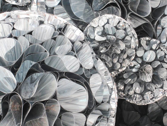
This artist was one of my Frieze favourites. Tara Donovan, with work dotted around the Pace Gallery’s booth, really took my breath away. Her practice builds upon organic structures and patterns, making them into very tactile and detailed sculptures and drawings. Below is a sculpture that activated my magpie instincts by bending the light inside it’s many shiny, conical formations; which together made a series of spheres. The viewer is left unsure whether it is constructed out of metallic foil, akin to a Christmas bauble, or something less fragile. 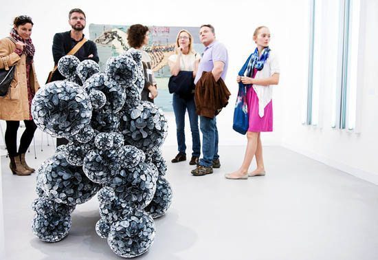
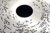
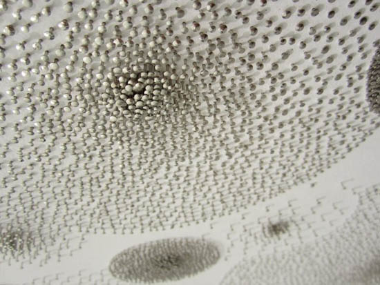
Below is another of Donovan’s pieces, very subtle and equally as tactile – appealing to my love of multiple elements coming together to form a pattern, and the obsessive process this must have required. This piece is drawn entirely using pins in board to construct this delicate shimmering drawing. See the detail below.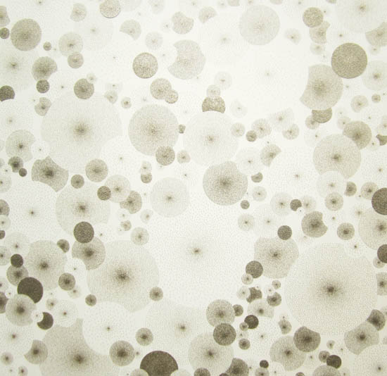
This next piece was beautiful and unusual, by Yuko Someya, ‘Heading to the Despair’. Created using Chinese ink, watercolour, pencil and Japanese paper on canvas. I show some details below, but these works were metres wide.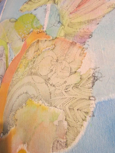
Text based artwork…
I was happy to see a lot of word and text based art at the show, and below feature a selection of those that stood out.
This piece by Navid Nuur at the impressive Plan B Gallery booth, was hard to capture on camera. Made of several sheets of glass casually resting against the wall, with silver writing on different sheets to make up a layered sentence ’Just another edge of present under standing’. Obscured by the viewer’s reflection, the different elements of the sentence became apparent from different angles and levels. I love a piece of art that makes you do a funny little dance in front of it before it reveals its meaning…
Neons were prolific, and in the format of Tracey Emin style signage/sentences, it felt a bit stale and unoriginal coming from so many different artists. A few were effective though. This pile of words had a more sculptural element whilst also feeling quite like a drawing:
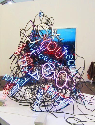
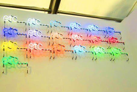 Peter Liversidge, 'etc'
Physicality and materials
I am often inspired by work which engages the viewer through its form or substance – a very physical, visceral connection can be formed when artwork appeals to our senses, and therefore places itself within a unique and personal context for every viewer.
The piece below, from Navid Nuur, was a magnetic rock onto which iron filings had been sprinkled – simple but fascinating, and highlighting physical forces that are present and sensed without being visible to the eye. It also took sculpture back to basics – a stone, an uncarved rock, the starting point of sculpture. In a way he was connecting traditions of allowing the material to instinctively guide the sculptor’s craft, responding to properties inherent in the raw material – the strata and form of rock, the grain and fibre of wood. 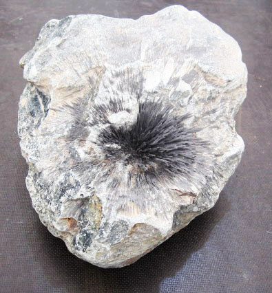
A sizable, bulbous , reflective Anish Kapoor gives us that slippery feeling that the room is peeling away from us in the Lisson Gallery space… 
I saw little actual painting, (and less that I truly liked), but this one stood out – John Korner, ‘The Flood’ on the Victoria Miro stand. It had a lightness and a layered quality with transparent areas juxtaposed to deep black swathes: 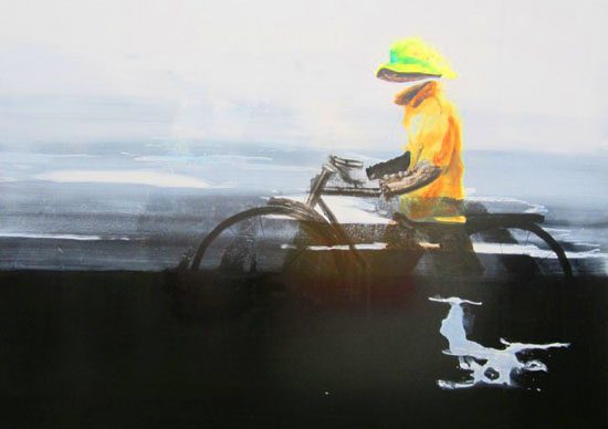
A very visceral photographic c-print By Tania Bruguera, rather different from all else that drew my eye: Quite unpleasant and hard to view, but strangely compelling to look at: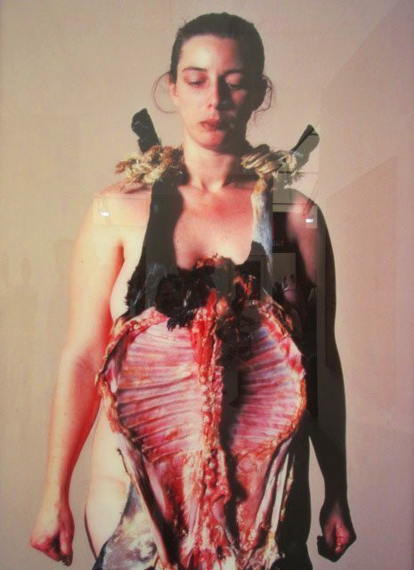
& finally a dash of silliness…
There was a lot of fun and silliness going on at Frieze; bright, childish colourful works seemed to shine out this year. Big, glossy, toy-like artworks paraded around us, such as Yayoi Kusama’s Tulip below at Victoria Miro: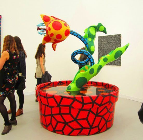
Nicola Anthony is an artist and art writer living & working in London. She seeks to discover things which make her mind crackle with creative thought. Catch @Nicola_Anthony on twitter, or her artist’s website
The aim of art is to represent not the outward appearance of things, but their inward significance. – Aristotle


