The sculptor Jon Kipps fashions materials in a way that reflects our contemporary world: industrial, functional, and increasingly anti-human – or rather anti-other. The idea of a hostile architecture is not new; moats, spiked trenches and gibbets spring to mind. But so too do the buildings in the purist style Le Corbusier designed in the 1920s.
Today we have curved bus-stop benches, spiked street areas in front of corporate offices, anti-climb walls and a number of other examples of street furniture devised to reduce the effect of constant human traffic. Kipps’ work, with its nod to the practical aspects of modern architecture, has a functional appeal. The crisp angles suggest we’re looking at something focussed by an expected use, the whimsical creative elements framed within strong workmanlike structures, which, while nudging us towards the lighter aspects of our character, also heighten life’s underlying hard truths. Indeed, art thrives on such ambiguities. Trebuchet asked Kipps about his work and practice.
How do materials create a sense of space?
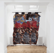
In my sculptural compositions I often like to play with a sense of perspective albeit in an abstracted way. By that I don’t mean perspective in terms of replicating a landscape scene, but rather positioning different elements to create points of focus within the work. For example the sculpture Project X has some thin lines of bright blue paper that all point towards the centre. The colour really pops against the brown textured background, but then also there are two slits that lead to a chamber inside the work that physically goes inside the wall it’s hung on, revealing another space beyond. I enjoy playing with the visual mechanics of various elements in relation to one another in different ways like this. Other sculptures like Turning Point lead the viewers’ interest to the sides of the work rather than the front.
Do you have a favourite material? What is it about that material you like?
I’ve always enjoyed working with wood. I like that it’s a natural material and it’s also possible to work with it even if you only have access to basic tools. Even if it’s just used to provide structure for another material, there will normally be at least one wooden element in every sculpture or a similar wooden composite material like Valchromat.
I do a lot of carpentry work alongside my artistic practice so I always have offcuts around and there is a big crossover with the techniques and tools I use for both disciplines.
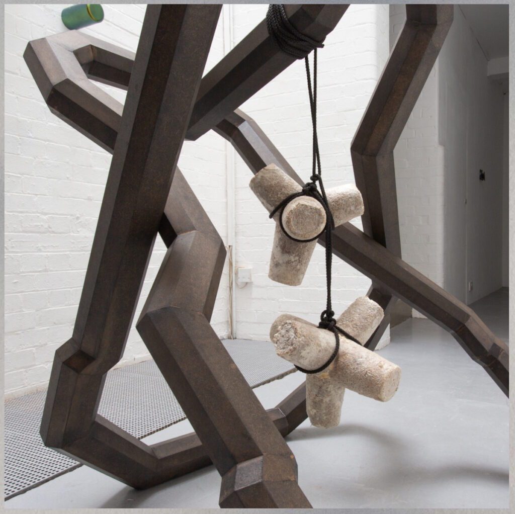
More recently I’ve really enjoyed starting to work with mycelium – the root structure of fungus that can grown into different shapes.
Do you consider your work to be sculpture, conceptual art, installation, a hybrid or something else?
They’re mostly sculpture in medium, but I have often described them as hybrid objects. This is because the work evolves from a combination of different found materials and source images – content that is often disparate or unrelated in subject matter that I splice together into different sculptural forms. I have built up a large bank of source images capturing a record of encounters out and about in the city that I can then use later on to help me get started on a new work or help me take an existing work in a new direction. The sculptures keep morphing in the studio until I settle on something that feels like it’s resolved or has started to become its own entity.
What is the role of the viewer in your work?
I’ve always tried to retain a level of ambiguity and to create intrigue with the work to encourage people to spend time with it. Viewing sculpture is innately a 3D experience and so I want people to move around the works and explore their intricacies. Colours shift from different angles, reflectors tingle as they catch the light, and holes and crevices reveal themselves in different places so I hope the more people explore them, the richer their understanding of the object will become.
In some ways viewing work like mine is an antidote to the infinite scroll of modern life online as the viewer is required to be present and in the moment with each object. It really can’t be summed up on instagram, they require a slower more intimate encounter.
Your work often has an architectural feel, how does structure play into your work?
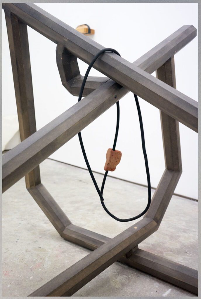
I’ve always been fascinated with architecture in terms of the power play between design, function, who it serves, who it affects and what feelings it projects into the world. In terms of the physical structure involved in architecture there was an architect I met in Japan called Azby Brown who described architecture as an illustration of the forces at play within a building. That idea really stuck with me and I think about it all the time in relation to the artwork I’m creating. Luckily for sculpture though it is possible to be quite playful and imaginative with those forces because most of the time it’s on a much smaller scale than a building and doesn’t have the pressure of people needing to live inside it. So as an artist I get to create things that can give the impression of being much more substantial than they actually are and I enjoy the contradictory nature of that. For example I often Dye MDF black so it looks a lot more like steel or concrete or something far more weighty. I’ll also play with multiple representations of the same thing such as the shape X which is used in construction to provide rigidity (diagonal bracing) to all sorts of structures from railway bridges to chairs, but also has many other associations in daily life such as a vote, a kiss, no entry etc.
Do you feel a connection to arte povera movement (everyday material and objects, ferrero rocher wrappers)?
Definitely in some ways. For me using low fi/left over/unwanted materials is very liberating for a number of reasons – In the studio I feel I can afford to take risks and go on a journey with half baked ideas because if it doesn’t work out I won’t have wasted loads expensive materials. But then found items can also become very precious to me in a different way because of their scarcity. For example, I might only have one piece of wood with that particular colour fade in the grain or one piece of cardboard pulp packaging in such a particularly interesting shape so I need to make sure I don’t rush when I start working with them cut them – I can end up being quite cautious about how I utilise the materials incase I’m unable to source another one the same shape.
I put a lot of energy into finding the right outcome for each thing and I think appreciating the materials on that level, despite their (lack of) provenance or value in society, goes a long way to instilling the sort of power or ambience I hope to create in the work as well as being a healthy antidote to the wasteful capitalist mindset we have all been conditioned to accept as the norm. It definitely sits better with me environmentally if I can reuse and stop things going to landfill rather than creating extra waste for the world.
It’s funny you specifically mentioned Ferrero Rocher. I have utilised that brand’s packaging more regularly than I should probably admit – The crinkled gold wrappers have appeared in sculptures and I used the plastic boxes as moulds for growing mycelium. My Mum always give me a box of FR’s at Christmas time, but I was very pleased to find in this year’s box they have started using a much more flexible type of plastic which will make de-moulding the mycelium super easy.
Your works often consider internal and external space, can you explain your approach to those areas?
I’m always looking for new ways to shift perception and so I think my approach to internal/external is largely to do with creating depth and encouraging people to look beyond the surface of something.
I had a show last year at Standpoint in London and decided to make a few works that would disrupt the normal confines of the gallery, opening up voids in the walls and giving people a glimpse of another world behind. People are always adapting the buildings or environments they in habit, adding things, taking them away or shifting their function especially in a city like London where so many galleries (like Standpoint) are situated in ex-industrial buildings. In the work I mentioned before called Project X I cut a hole in a stud wall and partially embedded the sculpture so it was actually quite shallow on the surface, but had two slits revealing the cavity and another surface behind. The openings were small, but enough to give a glimpse of the void and the space enclosed beyond the gallery wall. I had another sculpture in the front window display that gave a small glimpse through to the office and another mycelium sculpture that sat slightly recessed into a door.
The series of wall based sculptures I started 5/6 years ago began really after learning about attempts to create warning systems to protect future civilisations from the dangers of the nuclear waste that we bury underground. It will stay dangerous for hundreds of thousands of years and so will outlast whatever we try to enclose it. So much about enclosure is about protection whether that is protecting people from the radioactive material in the ground or protecting a precious object from the outside world so for me thinking about enclosure, interior and exterior are ripe sculptural topics.
In your artist bio you mention ‘hostile architecture design’ as an inspiration. What is it about anti-human buildings that you find fruitful?
I just find it fascinating how underhand hostile architecture design is. The people designing the spaces (public as well as private) are often trying to make grand, architectural statements or spaces that feel inviting or welcoming or attractive to certain groups of people, but then design is also actively used to push other groups away – purposefully make space unwelcoming for particular people or only accommodating for short spaces of time. Anti-homeless spikes are the most obvious example, but it’s also common to find benches at bus stops or train station platforms that are curved to stop anyone lying down, or sloped, too thin or at the wrong height for anyone to sit comfortably for any length of time.
Yet there’s something about being told you can’t do something that makes you want to do it even more. This was one of the problems with some of the design ideas for nuclear waste sights – the more ominous they looked, the more likely people would be to take a look. It’s the double sided nature of these things, the action vs reaction that I find particularly interesting.
My personal opinion is that the world would be a much better place if empathy could be designed into everything rather than out of everything and thinking that way should be the norm, not the exception to the rule. Hostile architecture design is so prevalent everywhere it serves constant reminders that we live in a divided society where those with privilege try to spread their power by limiting the actions of others in any way they can.
There is a frisson between the terms ‘modernist’ and ‘industrial’ both might apply to your work, what is your relationship to these terms?
With modernism the idea of form following function really resonates with my work as a lot of the sculptures hint at an idea of functionality. They look like they have been designed for a specific purpose e.g. control panels, alarm systems or holders for something, or signs etc however the exact function is ambiguous. I also like to think they feel like artefacts of some sort. Simon Faithfull wrote a really nice quote about my work last year in relation to this.
I find them something like ‘runes’ built from the off-casts of late capitalism. Something like a Star Trek episode where Kirk and Spock beam down to a new planet to find the locals worshipping a Ford Mondeo hub-cap – holy relics (or in your case materials) from a collapsed society.
I think there is something about the way I approach materiality that links in here too – making abstracted forms that feel quite assertive and using materials that seem very hard and angular like steel or concrete even if they are actually dyed MDF or mycelium.
Would you say your works had a political theme, or were commenting on the politics of the material world?
There are broader underlying political themes sometimes, but I’ve never wanted to make work that had a linear agenda to highlight one specific topic or make one particular point. The sculptures that I find most successful touch on something visually in a way that is incredibly difficult to talk about with words. That is ultimately what I’m aiming for however, yes there are often political themes in the pieces of the jigsaw puzzle that get the work to that point. For example I often use the colour purple which historically was exclusively for Royalty or the ruling elites until a chemist accidentally found another way to make it. Also many of my sculptures are named after punk bands so there is obviously a political slant there in terms of being critical of the power structures in society.
In terms of the politics of the material world that is definitely a consideration in the work and partly why I was drawn to start working with mycelium. Whilst some companies are already making their products with mycelium or using it to package their products instead of polystyrene, this will become more and more common place. In the future mushroom related materials will be so prevalent in our daily lives replacing boxes and polystyrene and I find that very exciting.
How do you approach scale?
My mantra tends to be small and mighty or large and quiet.
One thing I learnt when I started making smaller works is how they seem to gain more potency as they decrease in size. They also seem to be free of the tradition constraints people normally stick to when hanging a painting or a photograph on the wall and this can be really useful for making them feel connected to a space. Sometimes I’ll hang just one work on quite a large wall so it has a massive amount of space around it, but I’ll also hang it in the centre in terms of height as well as width. That would feel way too low if it was a painting, but somehow really works with the small sculptures
A good example of what I mean by ‘large and quiet’ would be the plasterboard column works which are a very rough or crude version of neoclassical fluted columns. They span floor to ceiling, but have exposed, scored plasterboard as the finished surface. I’ve made them 4/5m tall so the scale is substantial yet because they use the same language as architecture, they can almost blend into the room like some unfinished building work. In that regard they’re kind of the anthesis of a lot of big, assertive male sculpture.
The works that occupy the more middle scale tend to relate specifically to the human body (bigger than furniture, but smaller than architecture). Many of these works are also flat pack kits that have multiple ways of being installed as either freestanding obstacle objects or wall mounted presentations of the parts. They’re normally made using dyed MDF parts that follow the outline of the boot space in a car. This gives them a specific scale as well as shape.
What surprises you about your own work?
What I do in the studio is constantly in flux and that can lead to some very unexpected, (hopefully) exciting outcomes as well as a few big frustrations. Sometimes I’ll head to the studio with specific intentions for what I want to work on that day or a clear idea of how a particular thing should look. But the way those ideas translate into physical reality can shift dramatically at the drop of a hat. It can be infuriating to reach a point where you’ve worked on something for months, then get to a certain point and realise it’s not working, but then it also works the opposite way and awesome things can unexpectedly come together extremely quickly! I live for those surprises and have to constantly remind myself to be open to them and not get too rigidly engrossed on one outcome.
Read an article on Jon Kipps in Trebuchet 15
Read more in
Trebuchet 15: Installation
Featuring:
Installations as theatre
Giuseppe Penone
Michael Landy
Annette Messager
Karolina Halatek
Sounds Art as Installation
Jean Boghossian
Jon Kipps
Chantal Meza
Writer and academic Cartagena works in the arts polishing bios and gallery notes in the pursuit of clarity. He also lectures, though with enough opacity to impart wonder.


