[dropcap style=”font-size:100px; color:#992211;”]C[/dropcap]urated by Dan Coombs, Suspicion is the latest exhibition in the Jerwood Encounters series, and displays the work of 13 contemporary painters.
Coombs provides a introduction in the exhibition catalogue, offering an insight into a moment in the film that seemed to provide an analogy for painting.
“In Hitchcock’s 1941 film Suspicion Cary Grant ascends a darkened staircase carrying a glass of milk to his wife (played by Joan Fontaine) who suspects he is attempting to murder her. Does the glass of milk contain a deadly poison? We never find out.
The milk is uncannily lit from within by a small light that Hitchcock placed there: hole in the fabric of the film, an empty space, a void which renders the narrative ambiguous”
We might take the glass to be a container, a signifier, and the milk to be the thing which fills this container, the signified. Together they form a sign, but an unstable one, as if the glass might be emptied at any point and filled with a new liquid. This mirrors the semantics of painting and its intrinsic duality, where the permanence of the form is in contrast to the impermanence of meaning and narrative. Which is to suggest a painting is ‘an empty space’ waiting to be filled, occupied and activated.
All of the paintings in the exhibition invite this type of reading. In Stephen Chambers‘ ‘The Collector of 100 cups’ we are presented with a red room, two chairs, a table with a figure stood on top proclaiming and a scattering of 100 cups. A game could be played in which the above analogy is stretched to suggest a post structural reading of a painting, in which we might see its form as presenting itself to us in multiple ways, allowing us to hold a multitude of readings simultaneously. All of which is true but which uses the painting to illustrate a point, which is more akin to placing a glass on a shelf to admire your DIY skills as opposed to offering up something which might fit inside the glass.
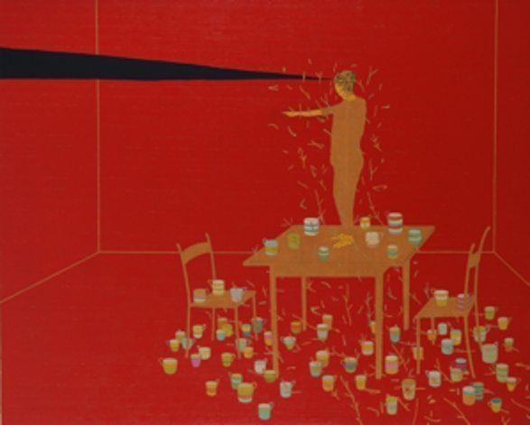 Stephen Chambers ‘The Collector of 1000 Cups’
When I look at the paintings I am not reminded of any post structural theory, but rather a PE teacher from school and a Slow Loris. I was probably six. I was frantically trying, and failing, to tie my tie and find a lost sock. The school changing room went silent around me as I looked up to see Mr. Slough’s finger pointing at me. The sign language could not be clearer, and it led an entire teams eyes to focus on me, all waiting as I was the last to spot the visual admonishment.
The same thing happens in History paintings, a pointed finger saying, look here, now. In the later it normally provides a key part of a lexicon of signs which help us understand what is going on where, when and why. Stephen Chambers’ paintings are often occupied by figures with outstretched arms and pointed fingers, except the feeling is closer to that of my experience with Mr Slough than a classic History Painting- I have no idea whats going on. Here the finger points off stage, to a space and action we cannot see, and which does not exist. It leaves us with that child like feeling of being told there is something we should see, and should know, but which seems unknown.
It sounds like the politics and philosophy of Donald Rumsfeld, but is actually about the poetry of painting. I am reminded of a poem by Jo Shapcott, in which she talks about the slow Loris reaching for a fly. The fly notices the advancing hand and sets off, but something about the biomechnics of the slow loris means it is unable to stop the motion of the hand, which continues to reach out and grasp at thin air. This is what it feels like we are doing when we view the picture, it is set up with a number of conventions which make us hunt for narrative, but each of them offers up nothing. The picture harnesses our desire for narrative to stimulate an engagement with looking in its own right- the solid red of the wall racing forward, broken by the lines of the perspective reopening the space; the careful obsessive arrangement of all forms in space. The finger is a paradox, pointing to non existence outside of the frame when the only thing we should be looking at is happening within.
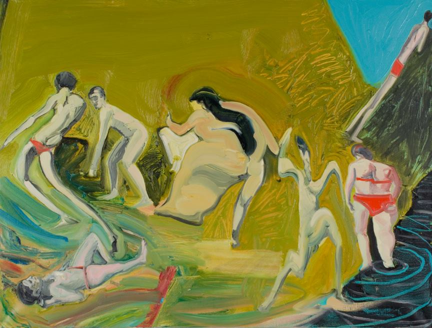
Dan Coombs includes two of his own works in the show. ‘The Beach’ is a wonderful thing. Figure and space is spread and stretched. The disjointed space is held together by the solidity of the central figure, the left leg of which references the photographic blur of a slow shutter speed and presents it with the impossibility of a blur in painting. The spread of flesh maps the coordinates of the space covered in time, but rather than speaking of the transience of movement, in which space is only temporarily occupied, it conversely speaks of a permanent colonisation of the entire space traversed thus reasserting the sculptural solidity and stillness of the figure. It is a painting which constantly references what it is not in order to reassert what it is.
All but one of the figures turn their back on the sea, facing inwards towards the land. They are dwellers within and seekers of the solidity and rationality of land, of what is known. The reclining figure may look to the amorphorous liquidity of sky, but they do it being held by the solid base of the ground and the firm hold of gravity. Only one figure breaks this, racing from the land towards the slither of revealed sea and beyond. This figure punctures the scene, as they seek to cross the frontiers between land and sea. We can imagine the figure out at sea, not waving but drowning, having let go of the certainty of knowing and embracing the exhilaration of drowning in the unknown. It is the play between these oppositions that the painting seems to suggest is at the centre of our experience of viewing it. The narrative structure seems to unlock ways of looking, and in looking, seeing.
Looking seems to be the central concern of Covadonga Valdes’ exquisite paintings. They deal in slow time, it inhabits their meticulous production and the careful attentive viewing they demand of the viewer. It is tempting to read narratives in to them, but they are more about narrative modes of looking than narrative content. Valdes builds spaces to move through, carefully layered up, so we pass through piece by piece.
Projection of what might happen or have happened is speculative at best. These are stage sets minus the actors, and that is because they want us to focus on the specifics of the pictures architecture and props, rather than concern ourselves with a drama that might or might not take place. They ask us to push through and then to rest, to observe and to engage with the minutiae of a delicately painted leaf, or to reach to the hidden depths of a lost river. The paintings by Valdes remind me of journeys through a forest, where the destination is less relevant than the visual stimulus and surprises that we discover on the way. [quote]In both Tait and Lyddon
there is an absurd mythic wit,
which fights any desire for
logical interpretation. As such they
feel far more like dream spaces than
any of the faux Freudian crap Dali
vomited out.[/quote]
They are beautifully crafted paintings and spaces. She stretches out time in order to focus our attention on the now, the constituent parts of the present. It is the timeless trick of painting, to hold itself up in opposition to life where time marches us relentlessly on, moment by moment.
Geraldine Swain and Damien Mead’s work deserves special attention. Mead explores some similar terrain to Glenn Brown, but is somehow folkier and with the references less explicit. Swains makes tiny enamels. On the surface they are unremarkable things but they carry a grandeur. I remember going to the National a number of years ago and a tiny Zubaran not only holding its own in a room of grandiose History Paintings, but seeming to have a gravitational pull beyond the loud shouts of its neighbors. Swain’s work similarly holds its own in the company of paintings which far more obviously strut their stuff.
Both Neal Tait and Kate Lyddon present paintings which remix a broad range of sources. Tait’s paintings are diverse in all aspects, with bold disjunctions between oppositions. There is a magpie quality, with images sourced from a wide array of media and then looped together in the search of formal, optical and narrative surprises. Spaces open up in unexpected ways, forms emerge and then collapse, there is an energy and musicality to the viewing experience. These paintings are reminiscent of the Leger paintings 100 years before, but reconfigured so that the topography of the digital age replaces the machinery of the city.
Kate Lyddon’s work is even more exciting. They are truly disturbing, not in the glitzy lazy ways of much contemporary art. ‘Man vs Wheel’ stayed with me for days after the visit. Odd Lynchian figures, half formed things, floating aimlessly in a blue space, the pissed, bedraggled performers of a failing circus of the psyche. Everything is suspended in a gravity free maelstrom on the verge of collapse. Her paintings have the quality of crude animations, with distinct visual styles jarred violently against each other, like some kind of anti Pixar in which all the seams are shown.
In both Tait and Lyddon there is an absurd mythic wit, which fights any desire for logical interpretation. As such they feel far more like dream spaces than any of the faux Freudian crap Dali vomited out. They present the detritus of our visual life, chopped up, filtered through the fractures of an internet age of terminal refreshment, then presented back to us as if the stuff that dreams are made of.
Much of the exhibition literature talks of the legacy of film and photography, but the internet and its spawned cacophony of imagery and new modes of looking is clearly also a player in this exhibition. Yet the range and variety of image and form in the show actually provided a counterpoint and a reminder of the ubiquity of so much contemporary visual experience, the internet included.
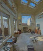
Certainly not all of the work fits neatly into this discourse. Freya Wright’s ‘Interior 2’ (right) is a subtle and sophisticated painting. We are provided with a birds eye view of a industrial space. Light is thrown through the windows, throwing shapes on the floor. Bottom 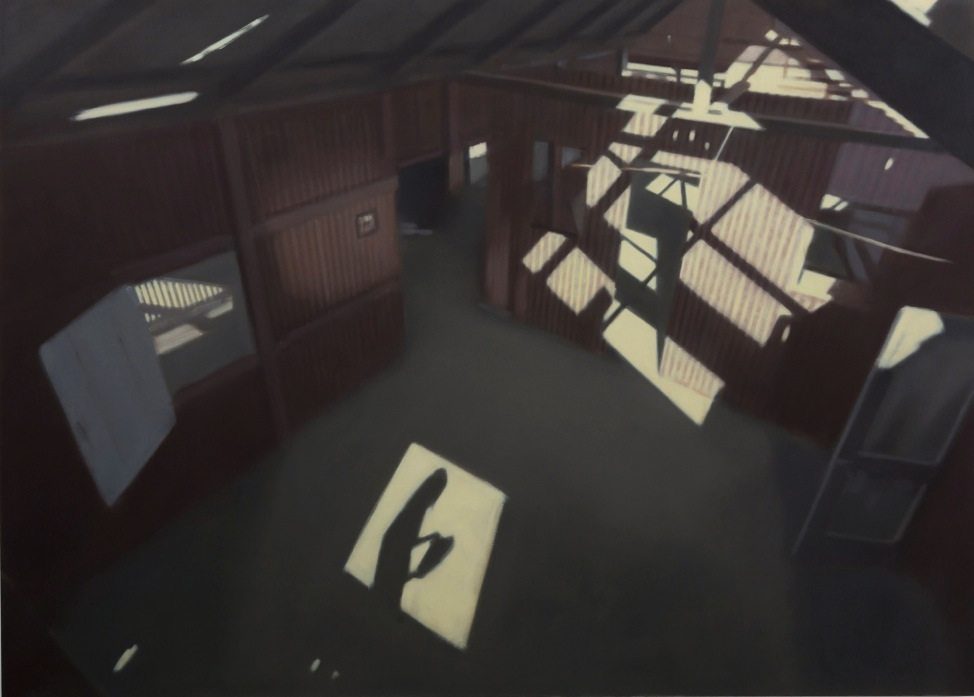 centre a rhombus punctuates the painting, with the silhouetted figure haunting its interior. It is this that throws the scene, which is otherwise of such calm clarity, into confusion, leaving us questioning what is seen and why. No answers are revealed, just forcing us to look harder and for longer.
It is a painting, like many in the show, which warrants time and attention in the flesh. So much of its quality is lost in print, as it power is in the handling of paint, in terms of colour and light in particular. It reminds us that paintings reward our time, open up slowly, revealing their secrets piece by piece. Which is to suggest that Freya Wright’s work might not be consciously a post internet painting, but it offer an antithesis to the age of a digital Mammon, in which visual information is consumed with a unquenchable gluttony.
Plato attacked art in his seminal text The Republic, suggesting that an image is a two-step reduction from the ideal form of a thing, and that its lack of function meant it was a unnecessary pollution. The situation might seem to have reached its crisis. The population of imagery expands exponentially, in a strange kind of cartography where the map becomes larger than the land it describes, so everything is mere simulcra or simulation. Are these paintings merely adding to that white noise? Or might they provide an antidote, a call to slow down and not just let stimulus hit our retinas but actually look and see?
The strength of this show is that it presents us with paintings that demand us to be active readers and engaged viewers, not just passive consumers. Quietly and slowly, they wake us up.
[button link=”http://jerwoodvisualarts.org/jerwood-encounters-suspicion” newwindow=”yes”] Exhibition Details[/button]

